Newbury Flats ロゴ
細部と使いやすさのバランスにおける課題が、最終的に浮き彫りになった考え抜かれたアイデンティティ。
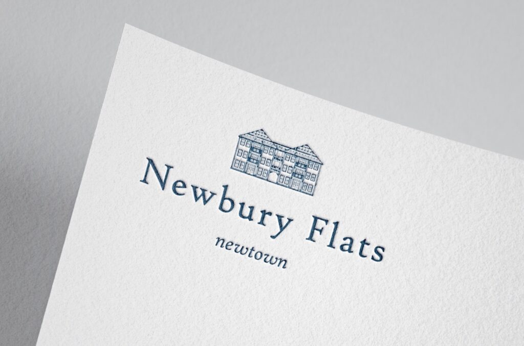
Engage Managementは、ミズーリ州セントチャールズにあるアパートメントのために、歴史的な雰囲気と現代的な美しさを融合させたロゴを求めていました。最終的なデザインは良いバランスを取れていましたが、細かなディテールが多く、使い勝手に影響していました。簡素化するよう私が提案したにもかかわらず、クライアントはより細かいデザインを選びました。その結果、小さいサイズではロゴの汎用性が下がる場面がありました。最初の画像は、クライアントの要望を保ちながらも、より使いやすさを高めるために再構築したシンプルなロゴ案です。
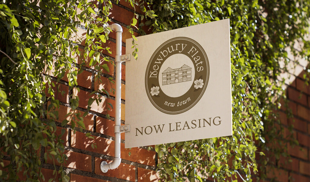
クライアントのメインロゴは、ヴィンテージの印章や紋章を思わせる円形のエンブレムとしてデザインされました。このコンセプト自体は良いと感じましたが、どちらかといえばセカンダリーロゴやアクセントロゴとしての機能に向いていると考えました。円形の構成と細かな要素が多いため、小さいサイズになると内部の文字が読みづらくなってしまいます。さらに、花のイラストと建物のアウトラインの両方をメインロゴに含めたことで、ロゴの柔軟性が低くなりました。スタッフTシャツ、看板、小さなデジタル表示などの用途では、細部が失われ、ロゴが認識されにくくなる可能性があります。それでも、このクライアントとの制作は非常に楽しく、また一緒に仕事ができれば嬉しいです。