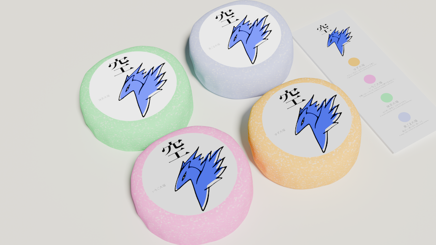
空 SORA Daifuku
Packaging for 空 SORA, a Japanese sweets brand with a playful modern aesthetic and bold personality.
SORA is a contemporary wagashi brand that reinterprets traditional Japanese sweets through a bold, character-led identity. Named after “空” (sky), the brand reflects freedom, movement, and individuality.
At the center of the design is Sora, a custom character created as the embodiment of a free spirit. Her sharp, expressive form brings energy and personality to the packaging, intentionally contrasting the softness and simplicity of daifuku. SORA challenges the quiet conventions of traditional wagashi packaging by introducing a playful, expressive identity designed to capture attention, convey personality, and bring a sense of joy and spontaneity to the everyday experience of Japanese sweets.
The project focuses on individually wrapped daifuku, using a restrained structure and soft, muted color palette to distinguish flavors: yuzu, matcha, strawberry, and black sesame. This balance between calm, minimal elements and a bold graphic presence creates a dynamic tension that defines the brand.
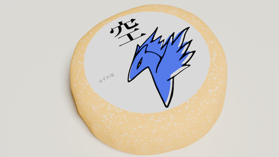
Yuzu Daifuku
A gentle sweetness with a refreshing hint of yuzu.
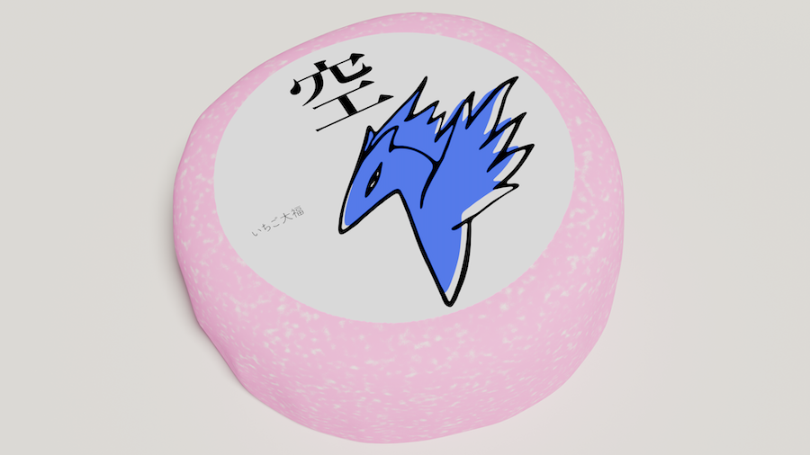
Strawberry Daifuku
Sweet and tangy strawberry wrapped in soft mochi.
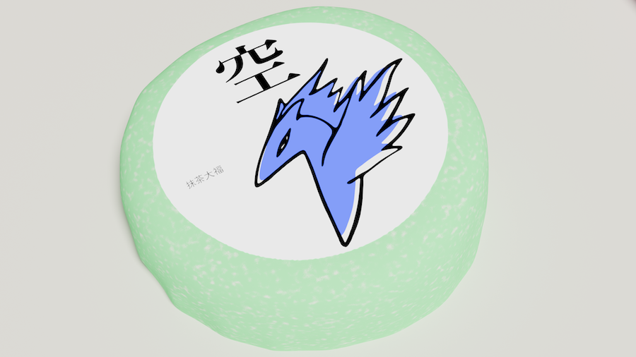
Matcha Daifuku
A smooth sweetness with a subtle matcha bitterness.
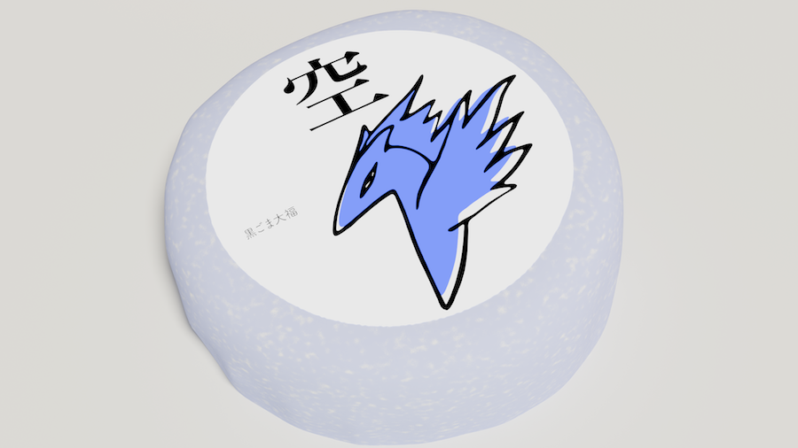
Black Sesame Daifuku
A deep, nutty richness of roasted black sesame.
My Design Process
01 — Research & Direction
Explored traditional Japanese sweets and selected daifuku for its soft form and playful qualities. Researched existing packaging styles and collected real samples to understand materials, structure, and presentation.
02 — Concept Development
Analyzed packaging references and defined an original direction: simple rice paper wrapping with a more expressive, modern identity. Began sketching ideas and developing a bold, character-driven concept focused on contrast and personality.
03 — Visual Identity
Created a custom character to act as the core of the brand. Developed a pastel color system inspired by seasonal daifuku flavors, balancing softness with a playful, energetic tone.
04 — Design & Production
Modeled the packaging in Blender and designed the logo and graphics in Adobe Illustrator. Applied the identity across multiple flavor variations and refined layout, hierarchy, and color.
05 — Finalization
Produced final mockups and presentation visuals, showcasing the packaging system and overall brand experience.